Watsons Introduces "Watsons Evergreen" in Collaboration with Pantone to Mark Its 185th Anniversary
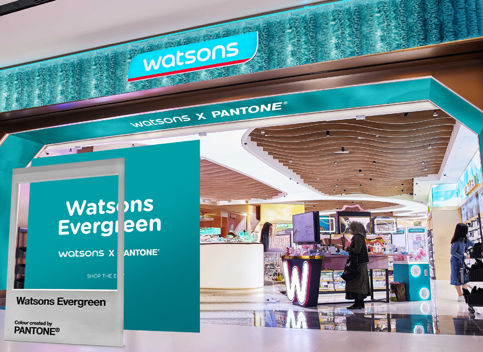
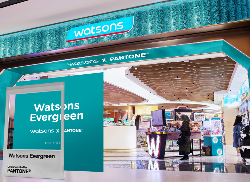
Watsons, the flagship brand of AS Watson Group, has unveiled "Watsons Evergreen" through a special collaboration with the Pantone Color Institute™ as part of its 185th anniversary. Launched under the slogan "Beauty and Care Time with Watsons Green," the initiative will reach customers through events and special product selections in 16 markets, including Turkey.
Watsons, the flagship brand of AS Watson Group, has introduced "Watsons Evergreen" through a special collaboration with Pantone Color Institute™ as part of its 185th anniversary. Launched under the slogan "Beauty and Care Time with Watsons Green," the initiative will reach customers in 16 markets, including Turkey, through dedicated events and special product selections.
Watsons, operating in health, beauty and personal care, is strengthening its brand identity with Watsons Evergreen, the new brand color that carries AS Watson Group's 185-year legacy into the future. Developed through collaboration with Pantone Color Institute™, Watsons Evergreen transforms the iconic blue-green tone that customers have long associated with Watsons into a unified brand identity on a global scale.
Introduced under the slogan "Beauty and Care Time with Watsons Green," Watsons Evergreen represents far more than a color—it embodies the relationship of trust Watsons has built with customers over the years, its commitment to renewal and its approach to good living. The brand expresses its vision of helping customers look good, do good and feel great every day through this new visual identity.
Meeting Customers Across 16 Markets
Watsons Evergreen has long appeared at numerous customer touchpoints, from the brand's logo to store designs, digital platforms, communications materials and Watsons-branded products. In this new era, the color is being positioned as a core element of a stronger and more unified brand identity.
As part of the campaign, events and special product selections will be implemented for customers and communities across 16 markets, including Turkey. The goal is to bring together the Watsons experience in different markets under a shared visual identity.
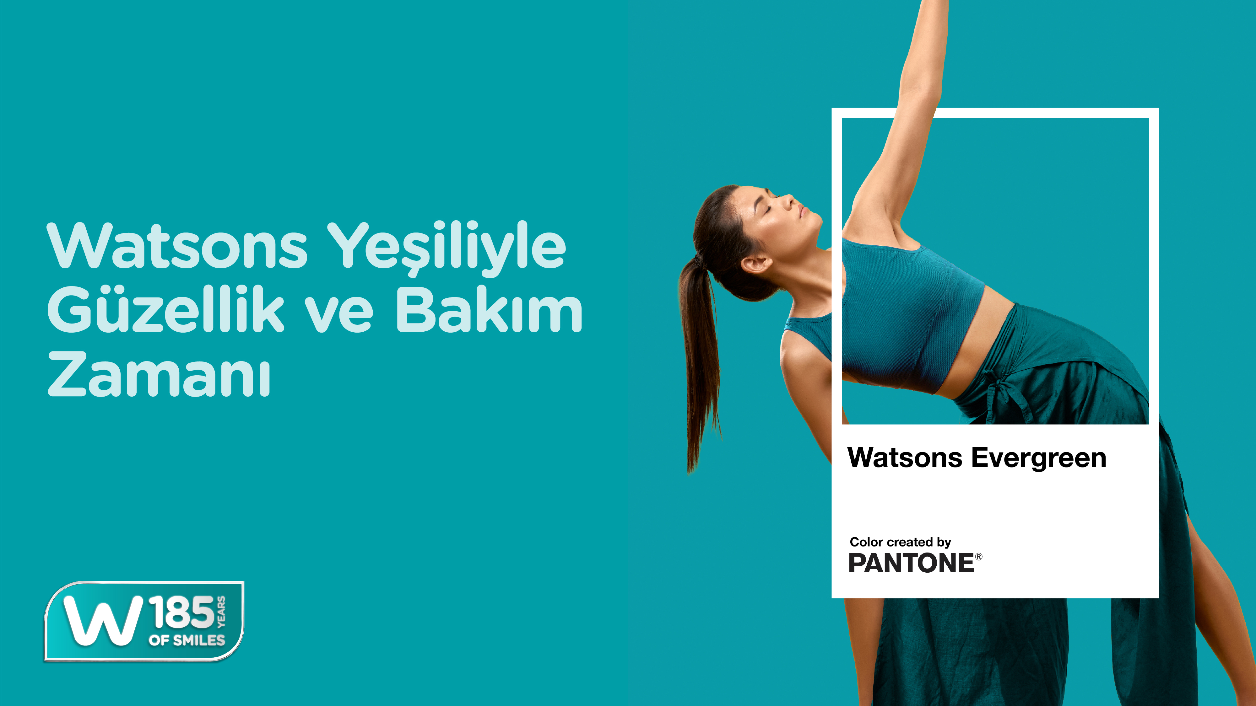
"Watsons Evergreen, a Symbol of the Bond We Build with Our Customers"
Through its stores and digital channels, Watsons continues to be part of customers' beauty and personal care routines. Drawing from the long-standing relationship Watsons has established with daily life, Watsons Evergreen represents concepts of trust, stability, care and renewal in a changing world.
Jared DeGuzman, International Customer Director at Watsons, commented on the launch:
"For 185 years, Watsons has contributed to making our customers feel healthier, happier and more confident in their daily lives. Watsons Evergreen expresses this role in a simple yet powerful way. Through our collaboration with Pantone, we have transformed our iconic brand color into a symbol of vibrancy, care and good living that will unite customers across all Watsons markets."
Cem Demiröz, Commerce and Marketing Director at Watsons Turkey, highlighted the importance of the collaboration for brand identity:
"Watsons Evergreen is a powerful brand element that reflects how we approach trust, renewal and positive energy. Through this collaboration with Pantone Color Institute™, we are strengthening the experience we offer to our customers through visual identity while consistently reflecting Watsons' forward-looking vision across all touchpoints. With Watsons Evergreen, used across 16 markets including Turkey, we will continue to inspire our customers and make beauty more accessible to everyone."
Laurie Pressman, Vice President of Pantone Color Institute™, noted that Watsons Evergreen reflects the brand's enduring journey:
"Watsons Evergreen reflects the essence of a brand that continues to grow and evolve while defying time. It is a color that expresses not only vibrancy and longevity, but also the deep and lasting bond Watsons has built with the customers and communities it has served across generations."
A Brand That Renews Itself, Inspires Trust and Stands by Its Customers for 185 Years
Watsons, touching the lives of millions of customers in health, beauty and personal care, carries its rooted heritage into the future with Watsons Evergreen. The new brand identity aims to strengthen the trust-based relationship Watsons has built with customers over the years through a unified and comprehensive visual identity.
Continuously renewing itself and continuing to respond to its customers' changing needs, Watsons will continue to provide inspiring beauty, care and good living experiences on its journey into the future, drawing strength from its 185 years of experience through the new brand identity Watsons Evergreen.
Gallery