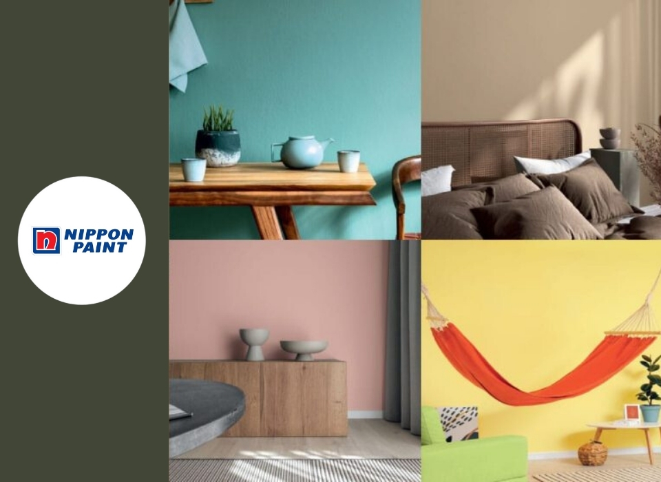
Recommendations for Choosing Paint Color
Choosing paint colors for your home can be a daunting task when there is an entire rainbow of options to choose from. Fortunately, after learning the basic rules of color selection, it can be easy to learn how to choose a paint color that beautifies a room. This guide will teach you how to select paint colors like an interior designer and offer tips and tricks to help you make quick and smart design choices for your home. After learning the fundamentals of color selection for a room, you can experiment with and find paint colors that bring your unique personality to each room.
Understanding Color
While selecting paint colors does not require you to be an expert in color theory, understanding the following terms can make color selection easier. Primary colors: Colors that can be mixed in various amounts to create all other colors. Red, yellow, and blue are primary colors. Secondary colors: Colors obtained by mixing two primary colors. Green, orange, and purple are secondary colors. Hue: A variety of a color. For example, aqua is a hue of blue. Hue can often be used interchangeably with tone or shade to describe a color's qualities. Tone: Produced by adding gray to a primary or secondary color. In practice, a paint color can be described as a soft or bright tone. Soft tones contain more gray, while bright tones contain less gray and are closer to the pure primary/secondary color. Tint: Produced by adding white to a primary or secondary color. Paint colors can be described as having a lighter or darker color tint. Lighter tints contain more white than darker tints. Shade: Produced by adding black to a primary or secondary color. In everyday language, shade and tint are often used interchangeably to describe how light or dark a color appears. Warm colors: They are shades of red, orange, and yellow. Warm colors typically evoke images of fire and convey feelings of both warmth and excitement. Cool colors: They are shades of blue, purple, and green. Cool colors typically evoke images of water and nature as well as feelings of calm and relaxation. In interior design, colors are selected and defined according to moods. The mood of a color is how it makes the viewer feel. Passive colors: Color tones that create a calming effect and support mental focus and relaxation. Blues, greens, and purples are generally considered passive colors. Passive colors are typically cool and soft-toned colors. Passive colors are popular choices for bedrooms and can make small spaces appear larger. Active colors: Color tones that create a stimulating effect and excite the mind. Reds, yellows, and oranges are generally considered active colors. Active colors are typically warm and bright-toned colors. Vibrant and eye-catching active colors are popular choices for kitchens, offices, and accent walls. Neutral colors: Color tones that do not fit comfortably into any of the primary or secondary color families. Neutral colors include black, white, brown, gray, and cream. In interior design, many color tones can be used as "neutral" as long as they are less saturated (that is, less vibrant) than accompanying colors. For example, baby pink can behave as neutral when paired with vibrant, rich colors like emerald, navy, or red.Tip: Among all paint colors for walls, bright white is the most popular choice. When matched with any décor color, it makes small spaces appear lighter and larger
Choose a Color Scheme
Selecting a color scheme for your entire room, including furniture and décor, can help you choose a paint color. A color scheme is any color arrangement or combination you use for decoration, so your color scheme can be as simple or ambitious as you choose. For beginning designers, selecting three colors is a great starting point. From there, drawing inspiration from your plan, you can select the exact paint colors you need.Recommendations for Choosing a Color Scheme
Look at a color wheel to understand how color families work together. Colors that stand next to each other on the wheel are called similar. Colors that are directly opposite each other on the wheel are called complementary. For a monochromatic color scheme, select various tones all found in the same color family. Neutral colors are perfect for creating an elegant monochromatic color scheme. For a bold room, try creating a color scheme using only primary color tones, also known as a triadic color scheme. Tones that all share the same color will create a harmonious color scheme.Testing Paint Colors
After narrowing down your interior paint options, it is important to see how each potential color looks in your home in both natural light and indoor lighting. The easiest way to do this is to get sample containers and paint test strips of the colors. Paint very large squares of the sample color directly on your wall. If you do not yet want to paint color samples on your wall, you can paint poster board and hang it on the walls you want to paint. Remember that painting on the wall will give you the best idea of how the paint color and finish will look, but the texture of poster board may not give an accurate representation of the final appearance of the paint. For the best color representation, paint at least two coats and/or start with a paint primer so that the previous wall color does not show through in the test strip and does not affect the appearance of the new color. Make sure the test strips are at eye level and that you can see them from a distance. If the area you painted is very large, paint test strips on two walls to see how the color works in all areas and light levels.Transition Color in Your Home
After learning how to choose paint colors for a room, the next step is to transition seamlessly to the rest of your home. When working with different colors for each room, it is good practice to use a darker or lighter color in adjacent rooms. For example, if your dining room is light gray, you can paint the adjacent living room a dark blue. Decide on a color that will be your main color throughout your home and use it as the wall color for your hallways or main living areas. This strategy works particularly well in open-concept homes. When standing in one room, consider all adjacent rooms you can see. Make sure all visible rooms have colors that work well together. For example, if you can see into the living room and kitchen from the entryway, the three colors of the rooms should be harmonious. However, bedroom wall colors do not need to be coordinated because they are typically behind closed doors. Selecting colors with the same temperature (that is, all warm colors or all cool colors) will generally be harmonious. Connect rooms by incorporating accent décor that matches the colors of other rooms. Add an accent or featured wall in a shade warmer or cooler than your main color. Finally, you can add comfort to long rooms by painting the ceiling a darker color.Advertisement
Ad Space728 × 90